New in CloudTables: Custom Button Collections
In our latest release of CloudTables we've zeroed in on the table control Buttons, adding a lot more flexibility and control over them. Customization of the table so it fits your application is fundamental to how CloudTables operates, and with this update we've added:
- Custom collections (drop downs) for grouping button types
- Collection display control (drop down or responsive fixed positioning)
- Spacer buttons for grouping and titles.
Custom collections
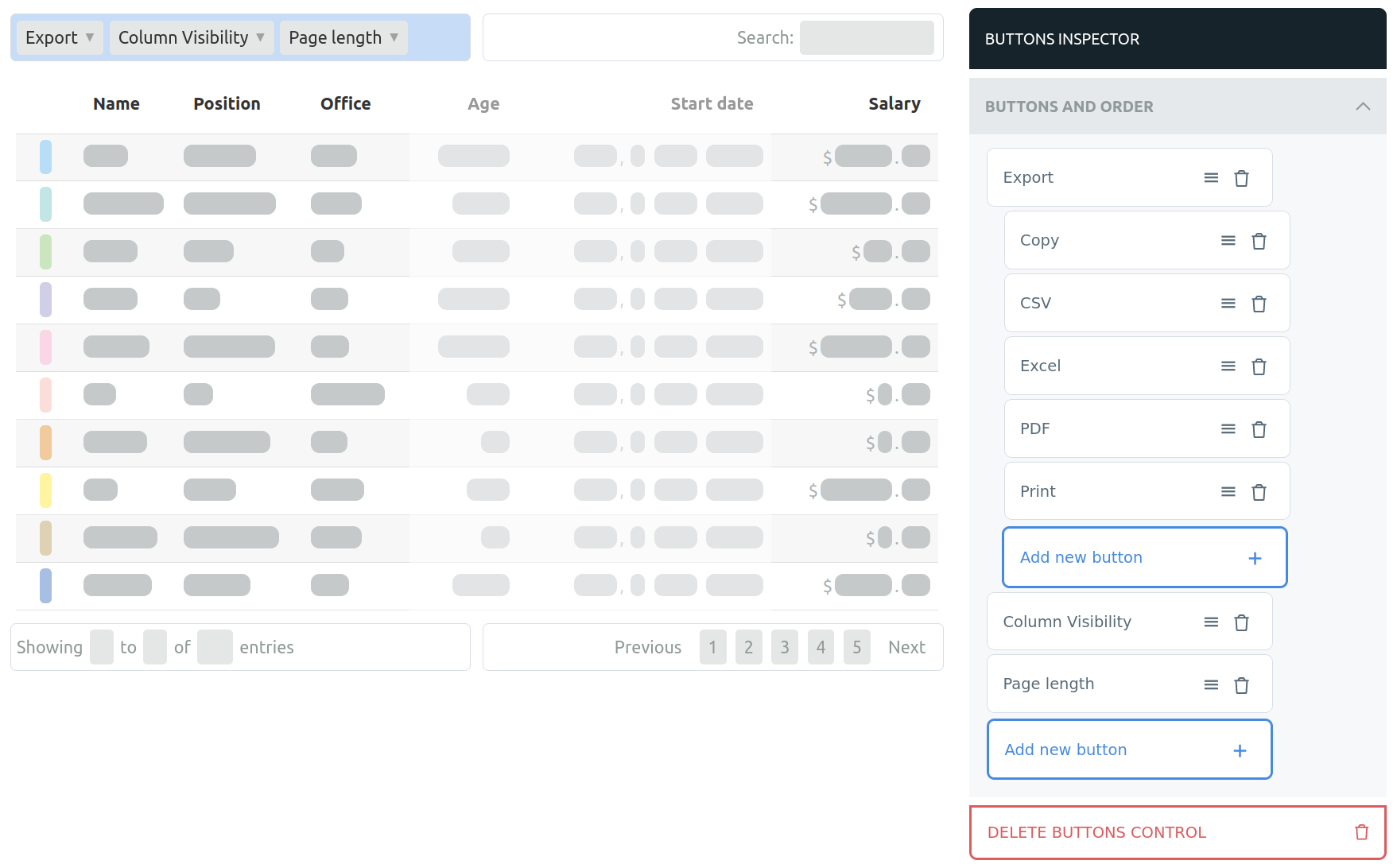
In the following example you'll note that we have three buttons shown at the top of the table:
- Export - a collection of buttons the user can use to get the data from the table. This is a standard dropdown with a custom selection of buttons and custom title.
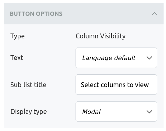
- Column visibility - automatically generated by CloudTables based on the columns available in the table. This button has a different layout selected in that it pops up over the whole page. It also has its own custom title text.
- Page length - similar to the Export button, this is a standard dropdown which controls the number of rows shown in the table.
Configuration
Buttons and collections can easily be added in CloudTables by clicking on the button collection you wish to modify. In the selector you'll then see the buttons that have been configured and have options for adding new buttons, changing their order and removing any that are no longer required.

You can also select button by clicking on it to change its configuration. All of the collection button types (Custom collection, column visibility, page length and column filter) have the option of specifying a title for the drop down and how you want to display it (as a drop down or modal).

Easier adding of buttons
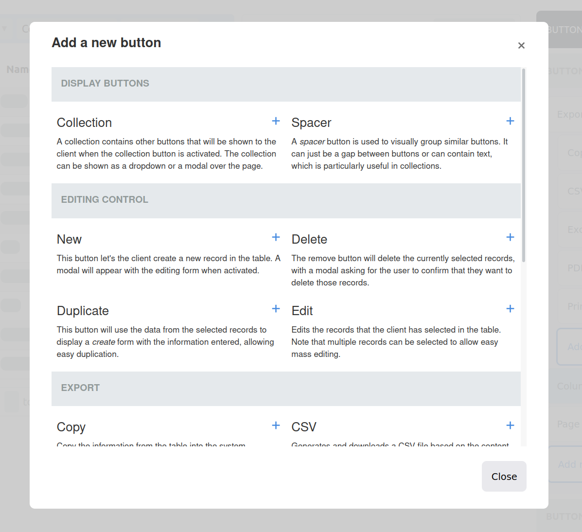
We've also reworked how you add new buttons to the group, with a much easier pop up giving you a selection of the buttons available and a short description of each. We are interested in your feedback on this change, as we are looking to roll it out to other aspects of CloudTables as well.

